No products in the cart.
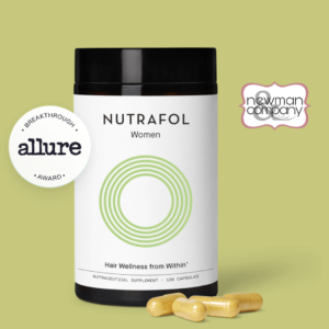
Newman & Co Offering Nutrafol Vitamins!
Looking for a vitamin supplement that can improve your hair


Building brands and creating cultures are cornerstones for many successful businesses. Most brand building starts with a name and a logo.
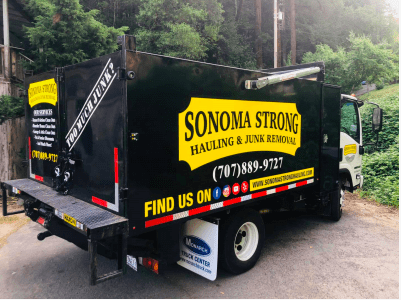
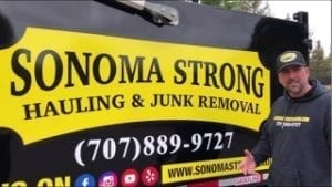
Logos are not just about what is aesthetically pleasing to the eye. A misconception in design is that a logo just needs to be beautiful, colorful, and masterful artwork. This is not the case for some of the top logos globally, such as McDonald’s, Apple, and Netflix. As you are reading about some of these top brands, did the images pop into your mind? A logo should look good; however, what is most important is creating an effective logo. As an owner of a marketing agency, I get the question, “do you like my logo?” My response is simple. I inform clients that it does not matter if I like it; what matters most is if the logo is doing its job. When someone reads the name of your company, does an image pop into their mind? I’ve been on many design projects over the years in the blue-collar industries. I am sharing one of my top choice logos in the junk removal industry: Sonoma Strong Hauling & Junk Removal, located in Santa Rosa, California.
Our clients love the name. Sonoma Strong has been a saying in our communities ever since the fires. As we’ve built a strong brand behind the name, there is no guessing who we are.”
– Matt Vick, Owner
Branding to Conversion
On the surface, it’s critical to reverse engineer the purpose of the logo design. For example, does the logo create a foundation for building a brand that will bring in sales, or does it just attract Instagram and Facebook likes? Branding is not a popularity contest; it’s a conversion tool for making income and building a culture around a business. A logo should be a piece created more with branding the business’s values while having the sales conversion process in mind rather than just aesthetics. In my assessment, Sonoma Strong’s logo scores high in this category. This leads to my second point.
Retention & Recall
Logos are something the audience, otherwise known as the client avatar, and repeat clients are targeted through marketing to remember. They will recognize a brand when a familiar billboard as they drive down the road, scrolling online with Google search, or see an awesome couple sporting their gear at lunch in Napa. Logo recognition directly correlates to the limbic brain. Like computer programming, logo designs go to a specific part of the brain to storing information for recall. So, in this case, the client avatar must find the logo desirable, engaging, and worth storing in the long-term memory. Please keep it simple, noticeable, and memorable. It does not hurt to use pleasant, familiar words like, in this case, Sonoma. Search Engine Optimization (SEO) is another factor that is critical when choosing a name that goes with the logo. When the Google bots crawl the internet, they are using A.I. to recognize keywords such as the city name and type of service, especially on local searches. This leads to my third point.
Client Avatar (Target Audience)
Business owners should build a logo with future targeted and repeat clients in mind. What are the demographics and psychographics of the area/client avatar? Sonoma County is a nice upscale area in Northern California. It’s clean, rich with excellent restaurants and attractions, and notorious for visitors drawn in by the wine country. The Sonoma Strong logo is clear, simple, and to the point. Their logo reflects their location, the services they provide, and the values of the communities that stand strong together.
Simple & Colors
The human brain is an incredible invention. It’s also predictable in some ways through measurable patterns. The brain best remembers 2-3 colors when it comes to logo designs. If color schemes exceed that amount, it’s like expecting someone to remember an eight-digit phone number or a ten-digital social security number. It’s psychologically counterintuitive. Black and yellow make a statement of strong, relaxed, confident, fun, energetic, attention-grabbing. Yellow is one of the primary colors and is considered one of the most effective colors in marketing. The Sonoma Strong logo is a rolling billboard reminder of “The Matt and Jo Jo Show” on their YouTube channel, growing as the number one channel in their industry. To learn more about Sonoma Strong Hauling & Junk Removal, check out their YouTube channel or the website at: https://sonomastronghauling.com/
Press Release by Jeff Glass of Alpha Media Group
Matt Vick
+1 707-889-9727
Visit us on Facebook
Looking for a vitamin supplement that can improve your hair
If you’re like most people, you have a lot of

If you’re like most people, you probably have a lot